Avoid 100vh On Mobile Web
Viewport units in CSS sound great. If you want to style an element to take up the full screen height, you can just set height: 100vh and voila - you have a perfect fullscreen element, which resizes as the viewport changes! Sadly, this is not the case. 100vh is broken in a subtle but fundamental way on mobile browsers that makes it nearly useless. It’s best to avoid 100vh and instead rely on javascript to set heights for a full viewport experience.
The core issue is that mobile browsers (I’m looking at you, Chrome and Safari) have a “helpful” feature where the address bar is sometimes visible and sometimes hidden, changing the visible size of the viewport. Rather than adjusting the height of 100vh to be the visible portion of the screen as the viewport height changes, these browsers instead have 100vh set to the height of the browser with address the address bar hidden. The result is that the bottom portion of the screen will be cut off when the address bar is visible, thus defeating the purpose of 100vh to begin with.
This is demonstrated below:
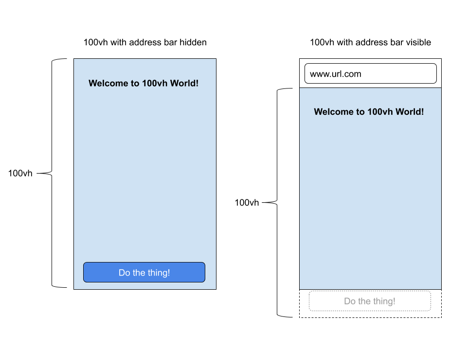
When the address bar is visible, the bottom of the screen gets cut off since mobile browsers incorrectly set 100vh to be the height of the screen without the address bar showing. In the image above, the button which should be at the bottom of the screen is instead hidden. Worse, when a user first goes to a website on mobile the address bar will be visible at the top, so the broken experience is the default experience.
A Better Solution: window.innerHeight
One way to get around this issue is to rely on javascript instead of css. When the page loads, setting the height to window.innerHeight will correctly set the height to the visible portion of the window. If the address bar is visible, then window.innerHeight will be the height of the full screen. If the address bar is hidden, then window.innerHeight will be the height of just the visible portion of the screen, as you’d expect.
You can see this in action when studying on Wordsheet.io. For example, try opening wordsheet.io/demo/V3Y on a mobile browser. The screen will be the height of the viewport regardless of whether or not the address bar is visible. Furthermore, by locking the height in place when the page first loads, it prevents the address bar from hiding in the middle of using the site thus creating an awkward screen resizing experience.
It’s a shame there’s still not an easy way to get an element to take up the full viewport height without relying on javascript. height: 100vh is so close to greatness, but given it’s limitations on mobile it’s best to avoid it.